boba Fett

Wednesday, January 6, 2010

Proof pin up for Image comics

Proof #25 came out today, and I did a pin up in there, so check it out!


This was originally gonna be colored by Riley Rossmo and I was very psyched about it, as he colors in a very unique way –see the cover for an idea of what I’m talking about...pretty spiffy , eh? In order to work with his coloring style, I left it penciled as I thought it would mesh better with Riley’s colors. Anyways, the deadline monster reared its ugly head and it was published directly from my pencils as seen below. To Alex Grecian’s credit, he did say if I waited for the next issue he’d get it colored and in there….but I opted to have it in #25 , as this was always scheduled to be a special issue with a number of Pin ups in there.


That Alex and Riley...top fellers they are…check out this book!

Sunday, January 3, 2010

‘Creativity nerve Central’…a.k.a. where the work happens!


Happy new Year ya’ll!

Over the holidays I had the time to read ‘Studio Space’ by Joel Meadows, which I really enjoyed. It’s quite interesting to me to see where the folks whose work I admire do what they do. Everyone’s workspace is so unique- just like their work. I highly recommend this read, it’s a great book.

With that said, here is my studio set up, where I’ve created almost all of my published work in the last 3 years.

Probably the most important thing that you can’t see is my computer and scanner. They are to the left of me when I’m sitting at my art board. My computer is where ALL my music comes from, so if I go deaf on my left ear only…now you know why! ;-)

Oh, and the Frank Quitely Authority page taped to my table is NOT an original (obviously) but a photocopy I made a few years ago. It was put there for inspiration originally, and now it has about 142 dots on it. Why dots you ask? Well almost every page I’ve worked on has had 2 or 3 vanishing points go off my page, so its come in very handy!! Actually, my whole table looks like it might have the chicken pox for this very reason…

Thursday, December 17, 2009

sketches


So you know how all art books you have ever read, always tell you to do sketches from life and you read it...think its a good idea, but still never do it? YOU SHOULD. Get over the fear that a person at Starbucks might freak out when you are drawing them..they never do. Often times they'll even ask to see what you drew!

In the last few months I've really ramped up the daily sketching and its helped a ton. It felt a bit like work at the beginning, but now its one of the highlights of my day. It REALLY helps to 'loosen up' your art.

The only frustrating part is that folks never stay still for very long!! Occasionally you'll get a great sketch going, then they move and its finished...its part of the territory! In order to help combat this, or when you can't make it out, just pop in a DVD and sketch out what you see. You can always hit the pause button to help work it out.

My last word of advice on this topic is to go for the GESTURE when life drawing, not the anatomy! I find if I start thinking anatomy, its over...you just dont have the time when you are dealing with seconds per pose. The gesture is really what you should capture here.


Now, when working from a live posing model, I've found....wait, that's a post for another day!

Monday, December 7, 2009

Futurequake cover -line art


Just a quick update today. Have recently finished the lineart for the cover of an upcoming Futurequake (issue #15)

The Extinction Hunter story is set to run in this book. The cover is off the colorist, I'll be sure to post up the color scan early in the new year, closer to the actual publishing date.

Thursday, November 19, 2009

Creating art from scratch..my process in detail.


OK, so I have to admit I love, LOVE reading ‘how I do it’ type web entries for the artists I follow, (Frank Quitely, Eric Canete, Art Adams, Gary Erskine etc) and I thought that it’s about time I share how I draw up what I do. Art geeks of the world…get ready!

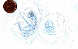
I start with my sketch book and I focus on getting a good line of action. I’m working very loose, very, VERY small, and generally just mucking about for ideas and inspiration. In this case my idea was to try a Wolverine Vs. Venom type battle. I made about 10 very small sketches and the one pictured was the most successful Wolverine one…. It felt like he had energy, and life. Basically, it spoke to me! ;-) To give an idea of how small I work I scanned it with a penny for reference. The other nine sketches get thrown out cuz they were ugly and just not working.


Now I grab a piece of cheap blank printer paper. My focus here is to keep the life and energy from the sketch, make it bigger, figure out a few details, and to make sure that everything will fit on the page. I’d hate to have it ¾ drawn and then have an arm or leg cut off or cropped badly. ( I learned this one the hard way! ) I’m staying very aware of ‘squash and stretch’ at this point in the process. I also decided that I’d need some heavier blacks in the lower left corner to help balance the Venom’s heavy black that I’d be using on the right. In my best teacher type voice: ‘Gotta keep that page looking balanced!’ Somewhere here, I also realized that I’d draw Venom’s head WAY to big, and wrote a note in blue pencil to shrink it and push it forward for more energy. No worries about mistakes though, that’s why this stage is here. The hard part for me is to NOT DRAW THE COOL STUFF, like faces muscles etc. I’m just getting a ‘template’ built that I’m gonna act on in the next (and final) pencil stage.


Ahh…the actual drawing! This is my favorite stage. The most bang for the buck! I use the template from the last stage and blow it up to about another 40% larger, so it now fits on an 11x17 sheet . I take a nice piece of Strathmore 500 Bristol and light box in my work from the last step. I’m using non-repro blue pencils here. Then once it’s all down, the rap music gets cranked, and away I go with my trusty mechanical 2H pencil! I’m pretty happy with it at this point. This is where I’d love to have a pro inker to hand this bad boy to…but since I don’t , its up to me to ink it.
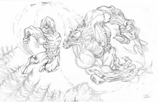


Inks are a bit funny for me. I enjoy it, but it just seems to take WAY longer than I think it will. I’ve learned lately to slow down and just enjoy it. Here I’m trying to use and create different textures. The jury is out on how successful I am at this! For most of the figures I’m using India ink and my trusty 102 nib, that’s old and worked in the way I like it. I also use some Microns for minor corrections after my erasing.


Now it’s off to the colorist for the magic to continue.

I hope you liked this post and/or found it helpful. Feel free to LMK. I may do another post like this again sometime!

Cheers,
Gibson

Friday, November 13, 2009

COLOR is good!!


I just realized that my blog is looking a little drab, as I haven’t posted up any color scans in a while.
I must admit that I’m not a strong colorist, nor have I spent the time yet to become one. My philosophy on this is… I’d rather become REALLY good at straight penciling and B&W work, instead of so-so and B&W and so-so at coloring by doing both at the same time. So, I’m focusing quite hard on my penciling right now. I have the luxury to do so as I’ve been blessed with great colorists!! I’m talking about folks like Jamie Grant over my work in WASTED, and Keiren Smith for everything else- including this Spidey. She does a great job, and can be reached at ktsssssmith@gmail.com for all those editors and folks that want to hire her!

Big thanks to all those folks who came by to say at the Speakeasy Gallery night last week. It was WAAYYY busier than I thought it was gonna be, and it was nice to see all sorts of comic-art interested folks.

Cheers!

GQ

Tuesday, October 27, 2009

Extinction Hunter -Futurequake 6 pager

Time is flying by!!I figure a blog update is overdue, so here you go.

I'm currently inking up a 6 page story 'Extinction Hunter' written by my pal Greg Dunford ( of Hardrive fame http://cyberpunkcomics.com/ ) Extinction Hunter is a great little story that will be in the next issue o Futurequake. I will also be drawing her for the cover of that issue, but I've not come up with a cover design I'm happy with yet. Once I do have it done and colored, I'll be sure to post it up. I'm really happy with how this story turned out -even with the new rather shocking and graphic ending. Here is th first page to give you a feel for the look I'm going for.


Those that know me, know I'm happy to work with good inkers, and I've been blessed with a few good ones. *cough, Gary Erskine, Cough!* However, this time it's 100% me on the pens and brushes. It's not that I dislike inking, I just find that it takes me a LONG time to do it. Couple that with the fact that it can seem like I'm just drawing the same image for a 2nd time, and I'd normally rather just stick to pencilling. This time though, I'm inking more freely and so far, I'm quite happy with it.

BTW, before I forget, For those in the Toronto Area, I'll be at the SpeakEasy comic show Thursday November 5th, 8pm-Midnight at The Gladstone Hotel, 1214 Queen St.West. Come on out and say hi!

Cheers,
GQ