Thursday, December 9, 2010
Ask an Artist on the 11th! - A3on11 - books?
Welcome to ‘Ask an Artist on the 11th, or ‘A3 on 11’ as I like to call it. It's a little early this month, as I'm keen to get right to it.
This month’s question comes to me via Facebook:
“Are there any books on art techniques/comic creating that "you" personally recommend?”
This is a perfect question for me, since I’ve read a TON of art books. (yes, a metric ton, I checked!)I mean, I have a really large collection of ‘em. This is partly due to the fact that I love to learn, and also due to an early phase I suspect lots of folks go through when first starting out.
See, back in the early days I thought if I somehow bought and read JUST the right book, everything would fall into place, and I’d become a great artist. An illustration ‘short cut’ as it were…no such luck. So, let me preface this discussion by warning that books are only 20-30% of what can help you. The rest is a combination of drive, focus and talent in my opinion. And practice! Lots of practice! I heard somewhere that every artist has 1000 bad drawings in them, you just have to get them out before you can really see improvement. I don’t know if this is true, but I sure choose to believe it.
I also believe that part of what will make a book ‘good’ for you, is where you are with your art. I’ve read a few books where it soon became apparent that it was a case of ‘too much too soon’ for it to benefit me. Basically, it was ahead of my time. I’ve gone back to books like this later on and they were much more helpful. Only THEN was I ready to internalize what they were trying to tell me…know what I mean? I think this is worth keeping in the back of your mind while you read art books. Sometimes it might be the right book at the wrong time.
By now you are probably thinking, GQ just say what damn books you like already! OK, alright! There are 2 books that I continually refer to, and probably couldn’t live without.
The first is ‘Gesture Drawing for Animation’ by Walt Stanchfield. This was available out on the web as download at one point, and that’s when I first read it. My copy is well loved, and I refer to it constantly. Basically, it helped loosen up my figure drawing, and helped me make a quantum leap forward with my art. With chapter titles like “Go for the Truth”, “A Visual Vocabulary for Drawing” , “Elements of the Pose”, & “A Sense of Story - talk to your audience through drawing”, I can’t think of a better more comprehensive art book. The first page of my dog eared copy says:
”Draw ideas, not things; action, not poses; gestures, not anatomical structures”
Reading that was like a light switch going off in my head. If that quote appeals to you, try and track this book down.
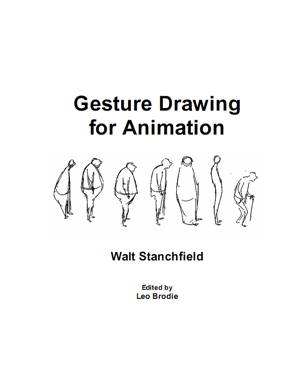
It has since been collected, updated and formally released as a 2 book set called Drawn to Life (The Walt Stanchfield Lectures) I bought these books, but I still prefer my old, worn, highlighted original copy the best. ;-) All the same material is in the new releases, but they messed up the order of the lectures and it doesn’t seem to flow as well to me . Still worth a place on your shelf though!
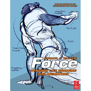
The 2nd book that really helped me advance my comic art was- and is- 'FORCE -Dynamic life drawing for animators’ by Michael D. Mattesi. This book really helped me figure out why some art has more energy and well…force, than others. Since energy and motion are elements I really like to play with, it helped give me a few tricks and tips to use to help turn up the volume in these areas as it were. (This one goes to 11…it’s one louder!)
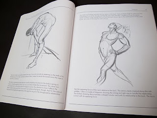
With chapters like “Seeing life”, “Forceful Form” and “Forceful Shape” it stays very close to what the title promises. It deals with rhythym, balance and straight vs. curved lines -how to use them to maximize the force of your art. You know, the stuff that Bruce Timm and other great cartoonists seem to do effortlessly. For some inexplicable reason the author put a section about animals as the last chapter which I skipped over. Hey, it’s his book, I guess he can do what he wants. Don’t let the livestock section fool you… I highly recommend this book .
Remember, I’ll be answering any questions you ask on the 11th of every month right here. Questions can range from very basic ones about general art creation and processes, to very technical comic creation ones. To shoot me a question, just email me (address on the right side on this blog), ask me on Facebook, or throw it in the comments section here. What I talk about just depends on what gets asked!
See you next month!
Commercial break- If you'd like to support small press, please go here and grab a copy of Undertow #1.
If you missed last month's 'A3on11', it was all about the process of creating a page of comic art from the script to the finished page...it can be found right here.
Thursday, December 2, 2010
Undertow #1 and the Organ Grinder
I can FINALLY tell the story of the Organ Grinder, Undertow #1 and 7th Wave comics! This comic has been over 8 years in the making…literally. I’ve been waiting a while to talk about this one.
Back when I was first starting out ( around 2002), I hooked up with a young writer named Luke Donkersloot through Digital webbing. He sent me a great little story and concept about a one armed gunfighter with a cursed organ and a chain smoking monkey. I LOVED the story, and signed on to do it. It was, I think, my 2nd or 3rd penciling gig. Luke and I were really in sync creatively. I drew and inked the first installment, and 10 pages of the second issue before the comic was shut down before ever seeing the light of day. Slightly crushed, (OK…very crushed!) I moved on to other projects and the Organ Grinder ( O.G.) pages sat in my drawer. A great story without a home.
*Sigh*
Fast forward to about a year ago, when Luke got in touch with me again, completely out of the blue. He also contacted all the other artists whom he had commissioned work from, and said he was arranging to get the work published in Undertow #1 with 7th wave comics. www.7thwavecomics.com Great news! So I grabbed my art from the archives and………realized that it wasn’t as strong as I’d remembered. *Double Sigh* I said to Luke,
“Wait! Don’t publish THAT! You have to let me rework the pages first before you go to print!!” Being the good guy he is, he agreed. I left the art's story telling alone as it worked well, but a few art tweaks/redraws were definitely in order. what I'm trying to say is that these pages represent a very unique hybrid of my raw rookie work and my art style now, 8 years later. Have a look and see what you think.
Good story so far, eh?
PLEASE support this comic by ordering one… right here! You need this book in your life! ;-) If you are of the opinion that more folks SHOULD support small press, here is your chance. Prove it by clicking over and grabbing your own copy. Good Karma awaits.
This is the first story (and first appearance) of the O.G., and we have big things planned for him over the next few issues. Check back for more O.G. updates shortly! In the mean while go grab the UNDERTOW #1, and tell them Gibson sent ya.
Thursday, November 25, 2010
Wasted # 6 now out!
Wasted #6 is now out at newsagents all around the U.K. and from Badpress’s website.
I have 3 pages in this one. For the benefit of North American readers, I’ll post up a sample page here. Due to an inking delay, the WOD ‘Narcobitch’ story mentioned below has been pushed out to issue 7.
My favorite story this issue has to be “Judge Head – He is the Blaw!” with art by Jon Haward. Shoulder pads that look like spliffs? Sweet design.
Alan Grant, Carlos Ezquerra, Alan Kerr, Jamie Grant, and Simon Bisley are just some of the great talent found in this issue. Do yourself a favor and grab it when you see it!
I have 3 pages in this one. For the benefit of North American readers, I’ll post up a sample page here. Due to an inking delay, the WOD ‘Narcobitch’ story mentioned below has been pushed out to issue 7.
My favorite story this issue has to be “Judge Head – He is the Blaw!” with art by Jon Haward. Shoulder pads that look like spliffs? Sweet design.
Alan Grant, Carlos Ezquerra, Alan Kerr, Jamie Grant, and Simon Bisley are just some of the great talent found in this issue. Do yourself a favor and grab it when you see it!
Monday, November 22, 2010
WASTED 8 COVER ART
Ok, this cover I'm really excited about! I can't wait any longer to show it here on the blog. I landed the cover gig for WASTED #8, published by the fine folks at Badpress . On this one, Frank Quitely was the cover editor, Jamie Grant was on colors and I did the rest. Yes....that 'All Star Superman' artist Frank Quitely and colorist Jamie Grant. We were just missing Grant Morrison, but what can you do?
Anyways, this is definitely not my first cover, but it will be the one that has the highest profile of any cover I've done. It'll hit the streets of the U.K. in about 7 months or so.
Oh, and I'm also told that Wasted #6 is now out. As soon as I get a copy, I'll put a sample page up here, and blog about it a bit. Check back soon.
Wednesday, November 10, 2010
Ask an artist on the 11th !
Welcome to the very first ‘Ask An Artist on the 11th’! Or, as I like to call it: “A3on11”. I’ll be answering any questions you ask on the 11th of every month for the next year. I think the questions will range from very basic ones about general art creation and processes, to very technical comic creation ones. In order to shoot me a question, just email me (address on the right side on this blog), ask me on Facebook, or throw it in the comments section here. What I talk about will just depend on what gets asked.
This month I’m going to answer both these questions:
‘What does a comic Script look like?’
and
‘Does the writer tell you exactly what to draw?’ ( which I think really means… ‘How do you know WHAT to draw?)
Alan Grant has kindly allowed me to put up part of his actual WOD script which will see print in an upcoming issue of WASTED. It looks like this:
This is Step 1. Get a good script to work from. Check. As I start reading I usually make little sketches/ thumbnails in the margin if I get a quick clear image in my head as I go. Inspiration and first instincts have always served me well in the creative process, so I try and capture them when I can. I didn’t do it too much here, but I knew I wanted to go for a big sexy glam shot to introduce Narcobitch.
I’ll generally read the entire script, then re-read it, then read it 3 more times. Gotta make sure that nothing gets missed! Alan always uses CAPITAL LETTERS in the script to make key items ‘pop’, and I find this VERY helpful. I recommend all comic writers do this.
At the top, the number of pages Alan suggested is 3 or 4, and the amount of panels required per page is not mentioned. Alan leaves this part is up to the artists. I could jam 17 panels onto page one in order to save room for a lovely full page splash on page 2 if I wanted. Hmmm….No, I’d never do this. I COULD, but I wouldn’t.
Please note how most of the design elements are vague leaving more room for the artist to work. It doesn’t say ‘crowded beach’ or ‘beach in the early afternoon on a cloudy day’. It’s left to me to design it visually. Since Narcobitch is going to murder someone in broad daylight, I decided it best to leave the beach pretty unoccupied. Especially since the next page is folks trying to figure out who killed the hippy agent. I’ve worked with writers who try and micromanage all the elements on a page. I don’t enjoy working this way. I think that if the script leaves room for interpretation, you get better results. Artists can then invest some of their personality and ideas. It is a collaborative medium after all.
I generally try to keep scene and same locations all on one page, but it wasn’t possible this time around. I thought about it, (hence the pencil mark above section 4) and tried it, but the last few pages became too tight and the story didn’t flow well visually.
I played around with the layouts for a while as evidenced by the very rough layout below. At this step I’m really just worrying about Narrative flow and word balloon placement. No actual drawing has been started yet. I also decided at this stage that an extra ‘beat’ would work well, so I split panel #3 into 2 parts by adding the silhouette panel and the close up panel with the smoking gun. I don’t do this often, but I felt it worked better in order to show her emotion as she spoke the dialogue. I used to minimize this layout step in my haste to draw stuff, but I’ve since realized that this is the MOST important part in making a good page of comic book art.
Now comes the fun part! I’m now confident that the eye will be pulled around the page as I want it to, and the dialogue is sorted. (ie: no crossed tails on word balloons. This keeps letterers like Jim Campbell very happy!) Now it’s all about cranking up the energy and emotion. Basically, just trying to make a cool page that will tell the story well!
Does this answer the question?
Monday, November 8, 2010
Sex, Violence, Wickedness and Suffering in Murky Depths #14 -out now!
MURKY DEPTHS issue #14 is out now and on sale here. This issue features a 5 page story called ‘Performance Anxiety’. For this story, I penciled and inked over layouts by long time industry pro (and all around talented guy), Ty Templeton. The grey tones were done by artist Eden Bachelder, and it was written by Greg Dunford - he of Hard Drive fame!
This was originally commissioned for the ‘Sex, Violence, Wickedness and Suffering’ comic, which somehow never saw print…imagine that! It’s like the censors were just waiting to pounce. Anyways, this story features a naked man at work, violence, naked women-also at work, sex, a nuclear explosion, the end of the world…AND it has a touching ending. All in 5 pages.
I had to look hard to find a bit of to show that wasn’t too graphic for my taste here on the blog. I found this part of page 2 which I cropped, but it’ll give you an idea of what to expect…
Saturday, November 6, 2010
SCI-FI art now book ...out now!
I blogged about the John Freeman's Sci-Fi art now book way back in April of this year. They selected art that I drew (and Keiren Smith colored) to be included in the book. I'm very jazzed about this, as it's my first coffee table 'art book'. Well, I'm happy to report that it's out and available right now. (just in time for Christmas!) Please click over here to order...
There are so many artists included, I can't begin to list them all. There is some really nice stuff in here. Also included are 4 out of 5 of my artist pals from the Fractal Friction webcomic...Kev Levell's entry is a personal fave of mine.
A great way to get a feeling for the artists invloved is to read through some of the terrific interviews with almost every contributing artist. Start here, and click around. It's facinating to hear directly from these creative folks. I've spent alot of quality time on the site .
Here is a brief blub about the book: SCI-FI ART NOW brings together for the first time the finest, freshest, and most exciting talents in the world of sci-fi illustration. Artists from around the world-from China and Singapore to the United States and Europe-are represented in this volume, which focuses on the latest and most imaginative work being produced today.
This book brings to light the most groundbreaking and talked about sci-fi art, ranging in media from comic books, movies, and TV programs to art, posters, toys, literature, collectibles, board games and video games. SCI-FI ART NOW is a comprehensive compilation that reveals fascinating background information, anecdotes, ideas, and inspirations relied on by the crème de la crème of contemporary science fiction painters, illustrators, and creators (whether established professionals such as Brett Norton, Liam Sharp, Paul McCaffrey, Klaus Hutter, and John Picacio, or brave new talents forging into the future).
This lavishly illustrated anthology shows the creative processes of speculative fiction’s hottest up-and-coming stars, and showcases some established creators who are breaking new ground to expand the genre’s already vivid visual landscape. Crammed full of exquisite art from around the world and fascinating insights from the artists and creators, SCI-FI ART NOW is perfect for the many fans of science fiction.
Sunday, October 31, 2010
SpeakEasy comic show
First up is another quick interview that got posted just last week . They asked some neat questions that I haven’t answered before. It’s posted over here
Next up, I’ll be attending the Speakeasy comics show on Thursday November 4th at the Gladstone hotel (at 1214 Queen St. West) here in Toronto. Doors open at 7pm. and run until 11pm. It’s ‘pay what you can’ at the door. This is the last public event I’m going to be doing until well into next year, so if you need some WASTED issues, and/or prints, please be sure to come by.
From the SpeakEasy website: The SpeakEasy Comics Show features an eclectic mix of Toronto’s talented comic book artists - from those who do newspaper strips and political cartoons, to underground comix and mainstream superhero comic books! The event displays an exciting cross-section of the comics’ community here in Toronto, as well as a glimpse into how good comics are made. As the old cliché goes, there is something for everyone.
Tuesday, October 19, 2010
GQ interviews
I've been really, really busy working on art for the next issue of Wasted, the first 'Undertow' issue -featuring the O.G.- and a few art commissions that I'm just finishing up.
As soon as I'm able to, I'll post up lots more details and (of course!)tons of new art. In the meanwhile, here are a couple interviews I've done lately which you can check out....new and improved, with video! ;-)
First up, an interview from the Montreal con on Youtube.
Then a 'Waster Taster' interview from the crew over at Badpress.
Sunday, September 19, 2010
HOLMES INC. launch and SPEAKEASY illustration show
Holmes Inc is ‘officially’ launched this Friday! Please come on out to join the Toronto Cartoonists Workshop as it celebrates the opening of its new permanent teaching space as well as its FIRST student publication - HOLMES INC.! Original artwork from the comic will be on display and copies of the book will be available for sale.
It’s on Friday, September 24 at 7:30pm –midnight and the location is at: 486 a College Street (upstairs) TCW studio space. I’ll be there signing books and chatting comics and art with everyone , so please come on by!
A few weeks later, due to a happy mix-up, I’ll be at :
SpeakEasy's 15th Annual Illustration Show
Thursday October 7th, 2010
Take a peek inside the collective imaginations of 40+ talented illustrators whose work features original styles, techniques and media. SpeakEasy has a reputation for showcasing the talent of Toronto's best illustrators. This colourful event is sure to be a myriad of fun in typical SpeakEasy Fashion.
Time & Space:
Thursday October 7th, 7pm-11pm
The Gladstone Hotel, 1214 Queen West
Second Floor Lobby + Studio Rooms
Cover:
Pay What You Can ($4.00 Donation Suggested)
See you there too!
Friday, September 10, 2010
More Fractal Fiction! page 38
It's time for more FRACTAL FICTION! Fractal Fiction is a web comic done by a talented crew of folks in the U.K. They use me a pinch hitter once and a while, (remember this?) and its time for me to step up to bat again.
The colors for this were done by Matt Soffe inks and letting by Jim Campbell, and driving the knackered old bus with script in hand, is the Emperor
The original pencils, looked exactly like this.
There are plans afoot to collect this into a printed version, but for now, I recommend starting at page 1 and having a read through. It's a wild ride!
Friday, August 20, 2010
Holmes INC!
It looks like HOLMES INC is set to drop very soon, so it’s finally time to talk about it! This is a project I’ve been working on with a number of local folks from the Toronto Cartooning workshops that I’ve taken. It’s all spearheaded by long time comic pro, and all around great guy, Ty Templeton.
The really cool part about this for me, is the fact that Ty has INKED my pencils for this one! As an added bonus, the lettering is done by Keiren Smith, who has colored my work in the past, and will again in the future. The pages look great, have a look below and see for yourself.
Advance copies of HOLMES INC. #1, will be on sale next week at Fan Expo. Look for it at the Toronto Cartooning Workshop/Fit to Print booth. Ty and I will be there signing the books on Saturday August 28th from 2-4pm. This book has lots of great new talent, and clocking in at 52 pages, it’s lots of comic for your money!
Please note: the ‘official’ release and launch party (along with website!) will be upcoming soon. Watch this space for details
Sunday, August 15, 2010
Convention appearances- Toronto and Montreal
They are coming up fast...so I'd better mention it here on the blog!
In 2 weeks, I'll be at Fanexpo Canada here in Toronto , in artist alley.
Or rather, MOST of the time I'll be in artist alley. I'm scheduled to run to panels interviewing Doug Mahnke (Green Lantern artist) Christian Alamy (Green Lantern inker) as well as Steve McNiven. ( artist on tons of stuff). If you don't know who Steve is, I can't help you. ;-)
A few weeks later (Sept 11th and 12th) I'll be at the Montreal comicon.
In both places I'll have some prints, WASTED magazines, Futurequakes and also the soon to be discussed 'Holmes INC.' comics with me. I'm sad to say all my sketchbooks are sold out as of the last con. However, my 'sketch hand' is strong, so feel free to come by and say hi!
Monday, August 9, 2010
WASTED #5 details and update.
I just got my copy of Wasted #5 in the mail, and finished reading it up.
As always, it’s a hefty comic tome, as it has 64 pages! That’s a good read for your money in my book. The ‘War on Drugs’ I pencilled up has 5 ½ pages in this issue, including 4 of them inked by Gary Erskine, who did a great job. I really enjoy working with him. Check out page 1 below.
WASTED also found another WOD strip that I did about 5 years ago and have since forgotten all about. It involves George Bush as president, so that should give you an idea about when I drew it! Just when I think they have used all my old stuff up, they find another page. ;-)
Some of the other terrific artists in this book are: Jon Haward Kevin Eastman, Kevin o'Neill, Simon Bisley, Alan Kerr, Jim Devlin, Alan Burrows & Curt Sibling. And that’s not all of them!
Please keep an eye out for this at news stands in the U.K. or they can be ordered at http://www.badpressltd.com/
Alan Grant has just sent me a great WOD Narcobitch script for the next issue, which I’m soon to pencil now that I’ve finished up all my other artistic commitments.
I will have 3 other books coming out in the next 3 months, so please check back soon, as I’ll post up the details when the books and their websites are ready.
Cheers!
Thursday, August 5, 2010
WASTED #5 is now out!
Sunday, July 18, 2010
COLORS ...by Tom Berry
Anyone who knows me, knows I CAN NOT do any type of coloring...at all. Sure, I know good coloring when I see it, but as far as doing it myself? No so much. Luckily there are some fantastic color artists in this world, (who probably all have computers that are much faster than mine!) some of whom like to work over my linework.
You may remember Tom Berry was kind enough to color the Venom Vs. Wolverine pic I did a while back. It looked alot like this:
When Tom saw my Dredd pages over on my Deviantart page, he asked If he could color one up. I emailled him a large scan, and just the weekend he sent along this page:
Pretty spiffy, huh? I dont even want to ask how long it took him, but there are many, many hours of work in there...trust me.
Tom Berry's a really good artist as well, just check his Deviant art site for a real treat!
Thanks Tom, this blog needs a dash of color every now and then. Good job!
Friday, June 25, 2010
Wasted #5 -So fresh and so Clean!
I’m working on the next issue of Wasted right now –number 5, and I’m really looking forward to this one coming out in the fall. It’s gonna have Gary Erskine on inks, and my pencils as seen here. I’m to have 5 pages in this issue.
Going forward, Johnny K and the ‘War on Drugs’ strips, will now have the latest and greatest art I can make. Wasted has now burned through the inventory of pages that I’d had banked over the last few years- including the ones I’d originally done for Wasted’s predecessor, ‘Northern Lightz’ magazine. Over the last few issues I think my art has been a bit uneven in places, mainly due to some of it being done 2 years ago! However, that’s all history now. I’m really happy to get my newest stuff out there, as I’ve learned a lot and improved dramatically in how I approach my pages. I think that the stories will be stronger for it. When compared to the older WOD work, I’m now trying to be more dynamic and exciting in the layouts and the ‘movement’ of my art…I hope it shows!
I’ll post up here when it hits the stands in the fall.
Cheers!
Tuesday, June 8, 2010
Get the lead out!
It occurs to me it’s been a little while since I actually posted any new art here on my ART blog. There’s a good reason for that, and it’s that things have been crazy busy with the cons, travel, and life in general. I’m also working on stuff right now that won’t be published for a while, so it’s a bit too early to show it off just yet. That said, I suppose I can always throw a sneak peek of a rough panel from page 2 of the next ‘War on Drugs’ strip ….
At the moment I’m working on 3 projects. They all have deadlines that are WAY to close for my liking. Basically, I’m a very busy boy right now! I’m penciling Wasted’s pages for issue 5, then I’m doing 7 pages for ‘ Holmes INC.’ with FTP. ( For folks that like art production stuff , very early details of that can be found over here.) I’ll be talking about FTP and Holmes INC more as we get closer to the launch of this one. Lastly, I’ve got a long delayed 8 pages for the O.G. over at 7th wave productions. Hang in there Luke, they’ll be over to you soon, I swear!
Many thanks to all the folks who came by the Fan Expo last weekend and said hello! I really enjoyed my 2 days there, and it went really well for me. I sold out of my Wolverine prints, (don’t worry I’m making more for the next con), all the Wasted magazines I had, and my sketchbooks also sold out! I’m planning to take some time and re-do the format for my next sketch book. I’m thinking I’ll balance it a bit by including both finished pages (like the Dredd page here)and the ‘sketchier’ stuff like Johnny K above. What do you folks think? Do you like to see ‘sketchy’ stuff, finished art, or both from the artists you like? I’m certainly gonna think this one over before I put out my next sketchbook. Feel free to LMK what you think. I’m just an email or comment post away.
A special shout out to the guy who brought me the pre-made, home-made ‘Wasted’ War on Drugs PAPER for me to draw on. My photo was taken a few times while I was sketching a Narcobitch for him, so if I get a picture I’ll post it up here to show you what I’m talking about. Trust me, it was a very cool!
Now back to the drawing board.
Wednesday, May 26, 2010
Bristol con wrapped. Toronto Fan Expo soon!
I’m back from what can only be described as a fantastic weekend at Bristol con. It was really tiring, but very, very enjoyable. I caught up with some old friends I hadn’t seen in a while, and made lots of new friends as well.
Big shouts out to the Glasgow light house crew - Jamie, Vince, Rob, Gary. Thanks for the hospitality, curry lunch, and translating the heavily accented Glaswegian waitress for me!
Bristol is a beautiful town. I had the good fortune of arriving 2 days before the con to visit friends. Those days were amazing. I lucked out with the weather, 25 and sunny the whole time I was there. Perfect weather for having a few pints, eh Paul?
The con itself was a bit weird in that it was split between 2 hotels that were a 5 minute walk from each other. I’ve never seen any con set up like this before, but it worked out fine. Upon arrival I realized a great bit of good fortune. Purely by luck, I was stationed right beside the Futurequake table! Awesome. This meant that Dave, Richmond and myself were able to spend time chatting away when there was a lull in the action. Top chaps those guys. The show was busy for me. I sold quite a few prints, ‘Wasted’ magazines which I was able to sign for folks, and sketched away for free as I’m known to do. With the exception of Nick Dyer’s Dredd, I didn’t really get any sketches myself. I was solo, and didn’t want to leave my table for very long. Big props to those kind folks who brought me caffeine to keep me going, you guys are saints.
Being the organized fellow I am, I forgot to pack my camera. So I’m only able to show one picture, and it looks like this. I’m there with Nick Dyer, Richmond Clements and Jim Campbell. I know a number of folks took my picture, and I’m hoping a few of those make it onto facebook or my email in basket. Next year the camera will be the first thing I pack.
My next order of business after catching up on some pages that I owe to Luke, is the Toronto Comicon Fan Appreciation event on June 5th and 6th . Details for that are over here. I’ll have some Wasted and Futurequake magazines with me so drop by and pick one up…they’ll finally be available outside of Europe!
Monday, May 17, 2010
THE GOOD THE BAD AND THE UGLY…and GUY DAVIS
THE GOOD
Issue #4 of Wasted is now out! It’s available at newsagents across the U.K., and also available over here. This issue’s cover features ‘Narcobitch’ who’s a character that I created with Alan Grant. The coolest thing about this cover, is it’s the first time I’ve seen one of my characters drawn by another comic artist professional. This time out, she was drawn wonderfully by Dave Taylor of Judge Dredd and Batman fame.
THE BAD
There was a mix up with some of my pages and the wrong art was used. Some of the WOD strips I drew were done years back, before I had a vague clue of what I was doing. Now that I’ve learned a thing or 2, (thanks Ty Templeton!) I’ve redrawn many of these old strips to a much better standard. Unfortunately, the new ones were not published, but the old ones accidentally were... So, if you get this issue please print out these 3 pages and glue them over the published ones. ;-) There is talk of doing a Wasted ‘war on drugs’ collected magazine, so all will be made right in the future. But for now…this is the best I can do. The Narcobitch strips were wonderfully inked by Gary Erskine BTW.
THE UGLY
One or 2 of the panels I drew on the old, accidentally published pages. Trust me.
GUY DAVIS
The second time I’ve seen one of my characters drawn by a comic professional was at a con here a few weeks ago. Guy Davis gave a great seminar and then drew up Johnny K from the War on Drugs in his own smooth style. It looks a lot like this:
For folks in the U.K., a quick reminder that I’ll have a table at Bristol-con this weekend. (ash cloud willing that is!) Details can be found over here.
Cheers!
Tuesday, May 11, 2010
My Interview at fan expo -The video
Here's something neat. I remember giving an interview at the last con, and then I promptly forgot all about it. That was until I was directed to this link
I recall the interviewer being very cute, and the surroundings being very LOUD, so that I had trouble hearing her questions. We talked about quite a few things, but she went with the Frank Quitely angle. See home many times I name drop the guy...Geez, how embarrasing!
I would put the video up here, but I dont own it, so please click over here to check it out.
Saturday, May 8, 2010
Subscribe to:
Posts (Atom)